Prospre
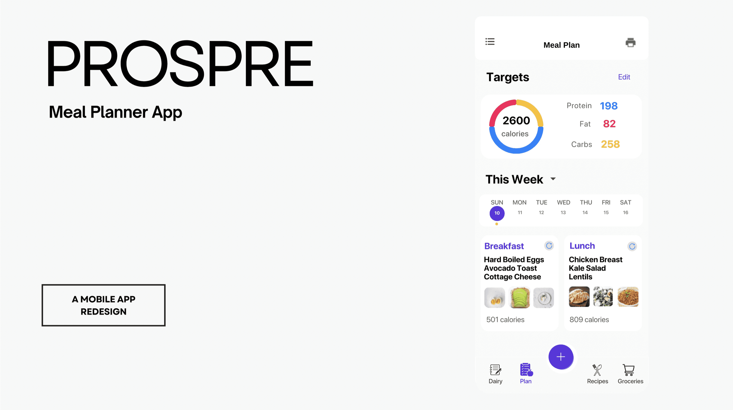
Prospre is a leading meal prep app. This project applies heuristics and WCAG 2.0 guidelines to improve user experience, accessibility and visual clarity.
Role
UX Researcher & Designer
Tools
Figma, Adobe Creative Suite, Notion, Heuristic Evaluation, WCAG 2.0
BACKGROUND
Prospre is a highly rated meal planner app known for its intuitive design and personalized meal tracking capabilities. It's KVP's are detailed meal plans, caloric and macro tracking, and grocery planning.
WHY?
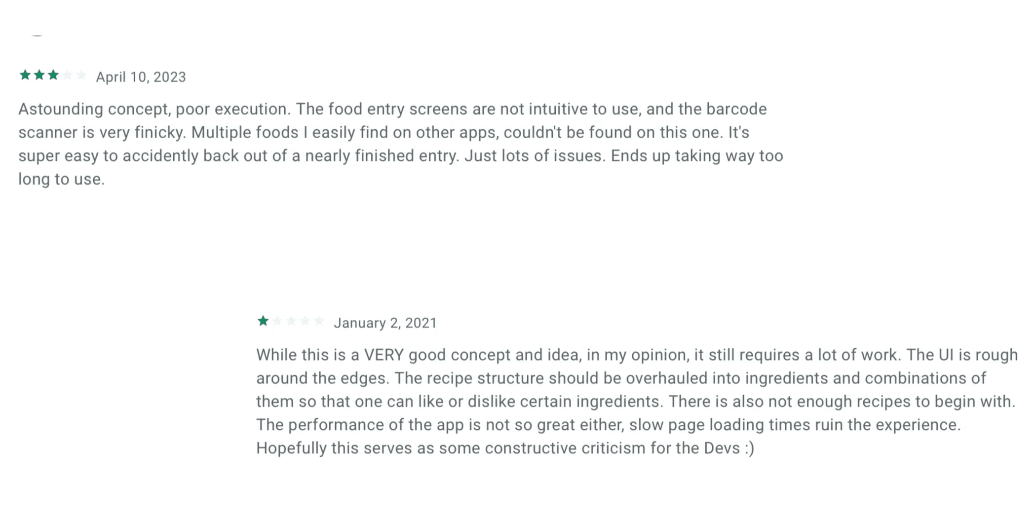
Despite the amazing functionality of the app, the app lacked clear navigation, layout and interaction design features.
REDESIGN PHILOSOPHY
Redesign was aimed to enhance usability through logic-driven improvements. By identifying heuristic and usability issues in Prospre’s interface, I aimed to create a more intuitive, accessible, and visually cohesive experience. Some guiding principles were - cognitive load reduction, consistency, accessibility, aligning design with mental models.
Here's some examples of what I did and why I did them -
KEY USABILITY ISSUES
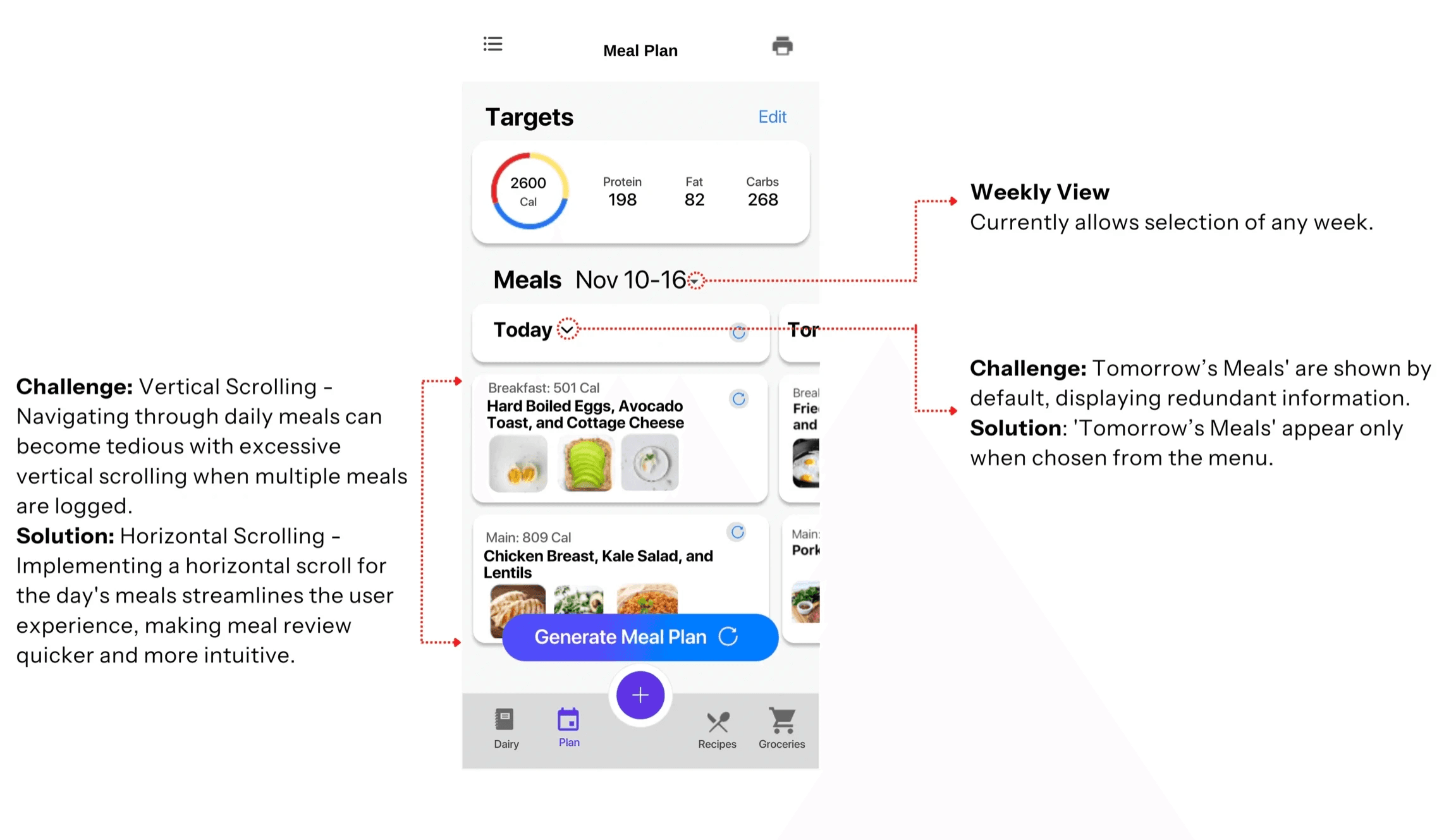
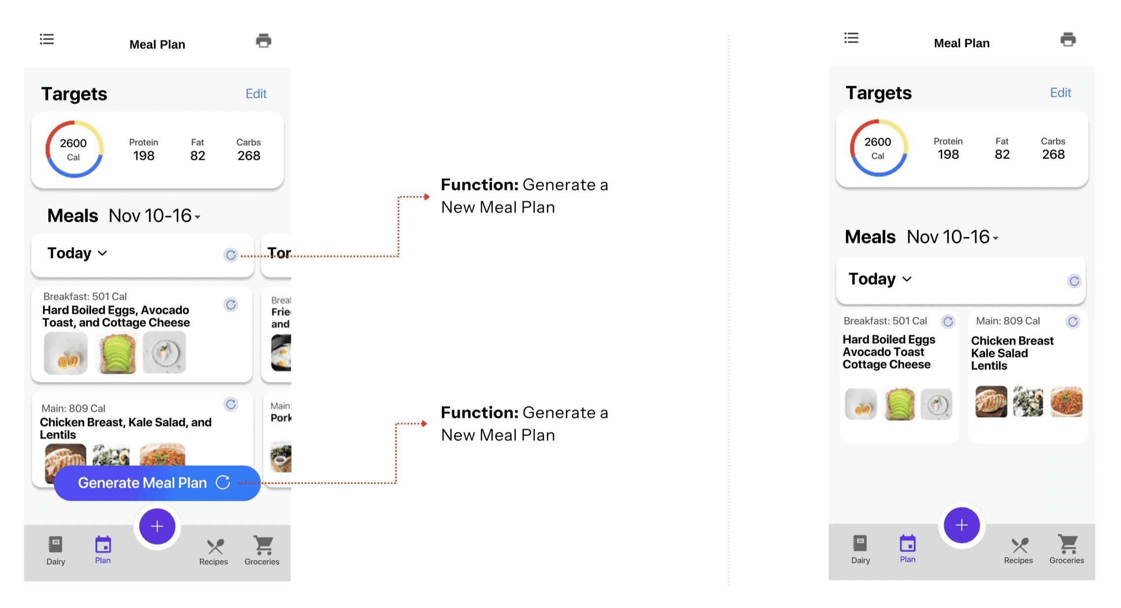
WHY HORIZONTAL SCROLL
1/ Ensures that attention isn’t fragmented by viewing multiple days/meals simultaneously.
2/ Naturally aligns with a left-to-right progression, mirroring the chronological flow of time (today to tomorrow)
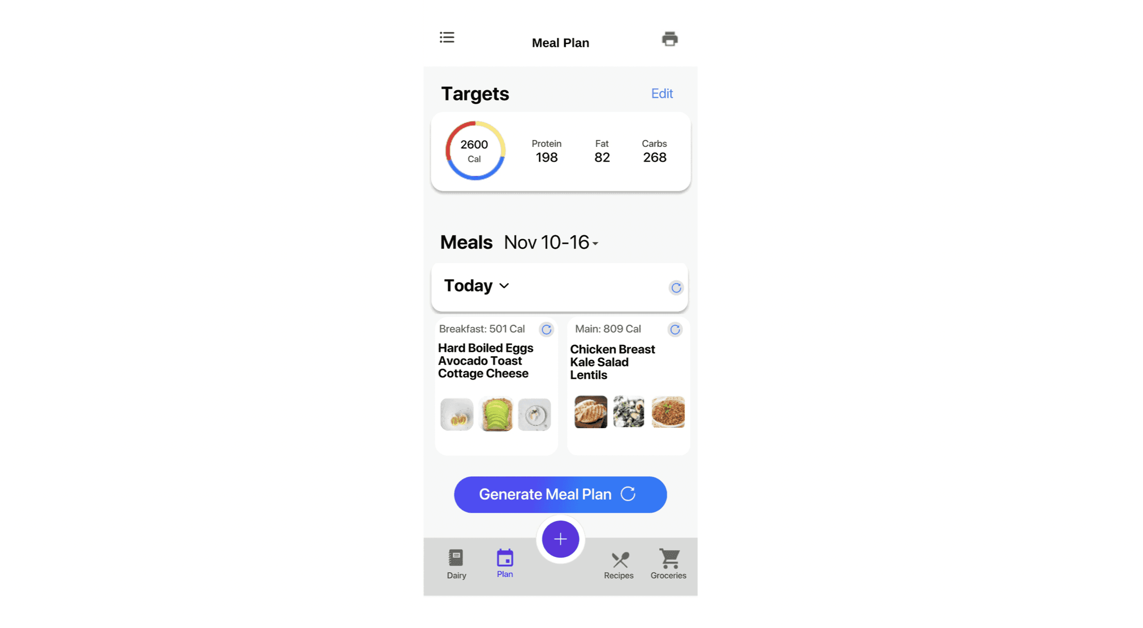
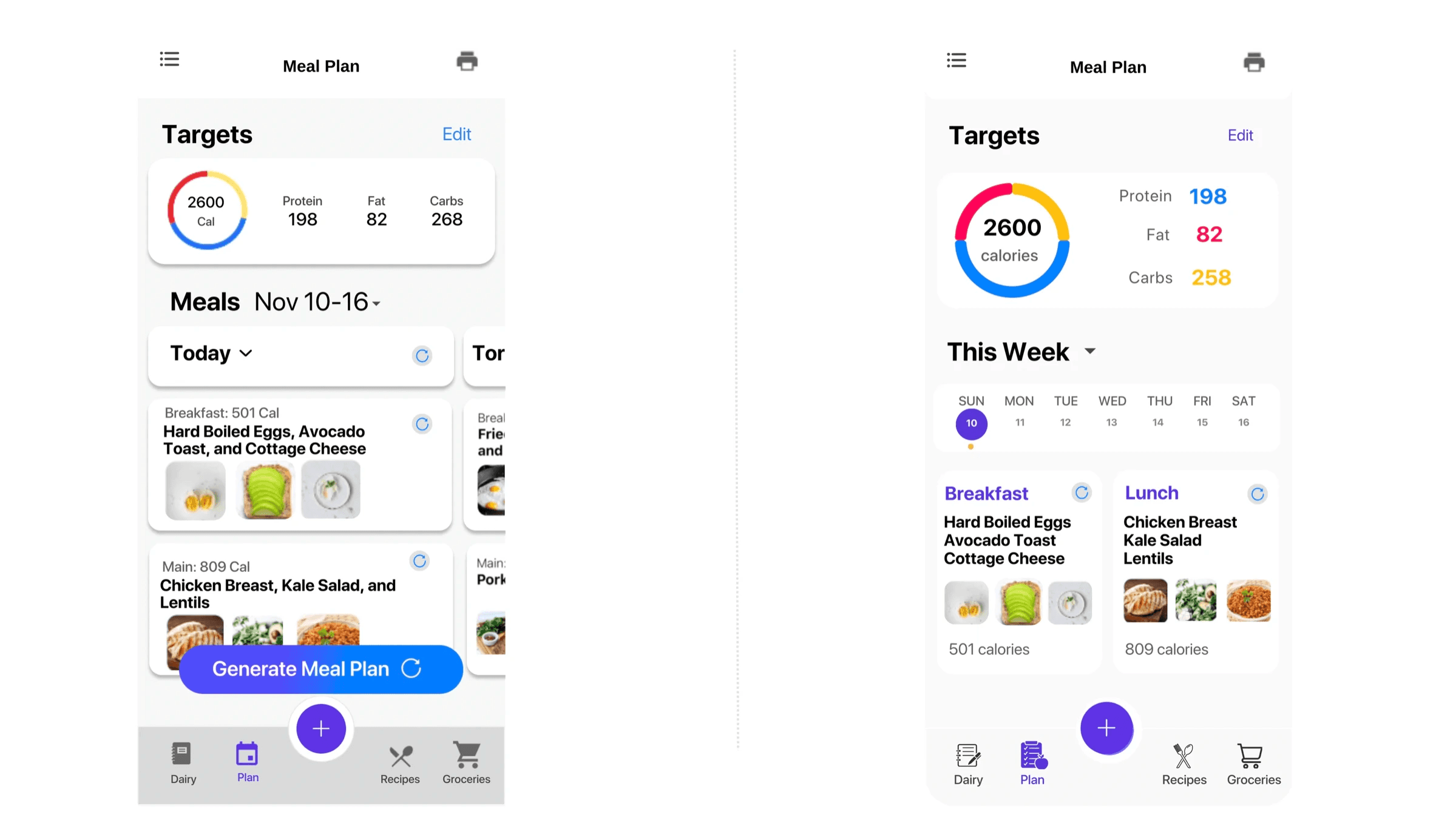
Here's the improved design:
REDUNDANCIES
The 'Generate New Plan' button is redundant because the app already allows users to create a new meal plan directly from the daily meal selection interface. Removing the CTA button will help decrease cognitive workload as well as draw the user's attention to what's relevant.
CLEARING CLUTTER
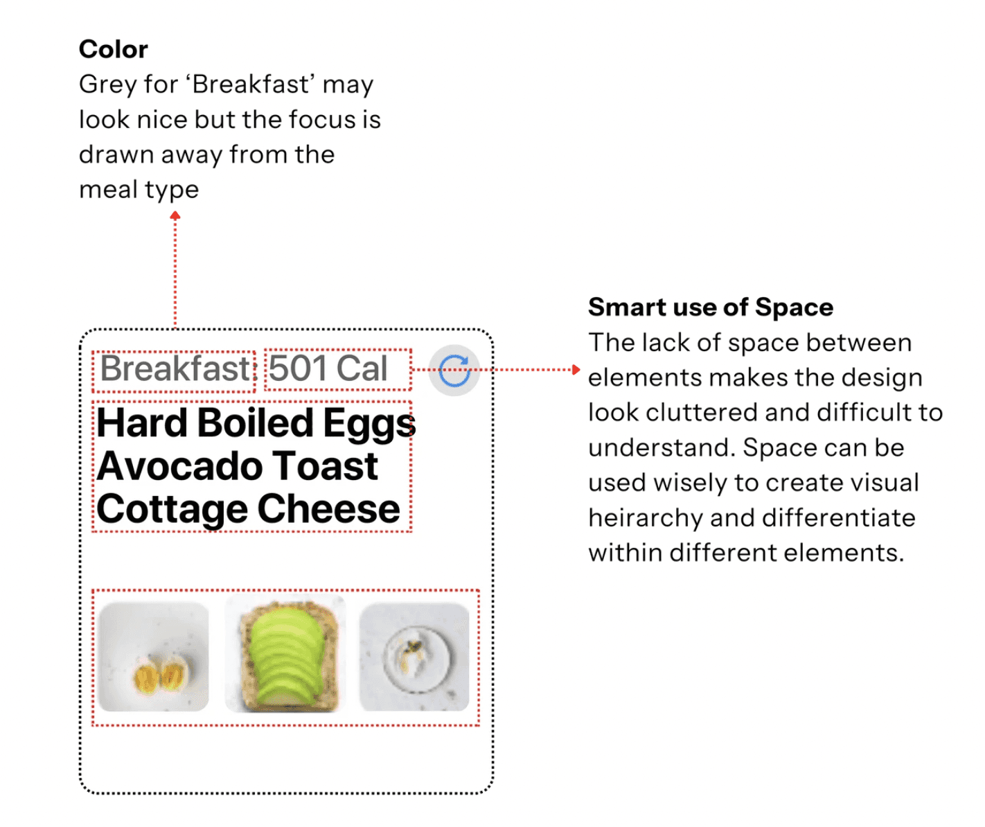
Multiple elements with similarly strong prominence are competing for attention. Meanwhile, the action buttons don’t stand out at all.

VISUAL HEIRARCHY
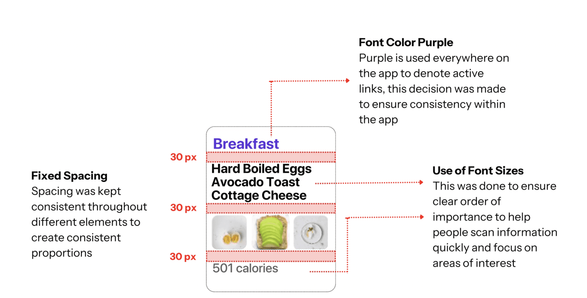
Lack of clear order of importance, or visual hierarchy creates difficulty in scanning information quickly or focusing on areas of interest. Let's create a clear visual hierarchy using variations in size, color, contrast, spacing, and proportion.
CONSISTENCY IN VISUAL CUES - COLOR
I want to use consistency to make sure that similar elements look and work in a similar way. This predictability functionality improves usability and reduces error. Color as a visual cue to differentiate between different interactive elements.The color purple is used to indicate an interactive element on our app, let’s make sure that the color and font size are consistent across similar functions on the app.

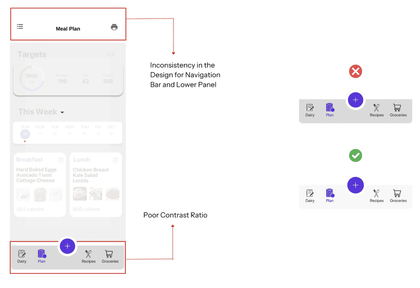
CONSISTENCY IN VISUAL CUES - ICONS
Filled icons usually indicate that the element is selected. The goal is to maintain familiarity with the standard user experience and decrease the cognitive load on the users by replacing them with more apt icons and a legible font size.

CONTRASTS
Contrast is a measure of the difference in perceived brightness between two colors.
Let's adhere to the Web Content Accessibility Guidelines (WCAG) 2.1, level AA, and ensure that all user interface elements, like buttons and form fields, have at least a 3:1 color contrast ratio.
APPLYING SAME PRINCIPLES TO THE PROGRESS BOARD
What do the blue, yellow and red represent in the ring? How do we make it more intuitive for the users to understand their progress?

FIXED
With applying a few design logic rules, I wanted to see how critical they were in transforming the user interface into an intuitive and cohesive experience, demonstrating that even simple design changes can make a significant impact on usability
Interested in connecting?
Let’s talk projects, collaborations, or anything design!
Copyright 2024 by Priyanvada Darshankar