Next Gen Retail
An exploratory case study of where Mixed-Reality stands in retail.
Role
UX Research
Tools
White Paper Research, Lottie, Miro
BACKGROUND
1/ Digital designs can be much more cost effective and resource efficient in creating or simulating a physical space.
2/ There is plenty of leeway to create artistic designs that may not be possible in physical reality.
3/ There is more scope for safer, more accessible and more customizable designs.
HIGH LEVEL GOALS
1/ To fill the gaps within the current environment and NOT create a new one.
2/ Overlay the virtual space on top of the existing physical space.
3/ Make the elements interact with people and space
Result? Spatial experience where the digital fabric is woven into the physical space of the store.
WHY MIXED REALITY?
1/ Virtual Reality replaces the real world. Captivating? Yes. But it also isolates the user from real world sensory experiences and interactions.
2/ Augmented Reality overlays the real world. This maintains a link to the real world but can still limit sensory engagement to primarily visual stimulation.
3/ Mixed Reality blends real and digital world with the real world.
LET'S LOOK AT THE HUMAN BRAIN
It is important to be mindful of the impact and implications of technology. Human brain needs stimulation and multi sensory experience.
A great example would be how tactile sensation enhances learning and memory retention (Gallace & Spence, 2009)
A normal brain needs interaction and activity for the cells to grow. What happens if you block one, or several senses, for a prolonged period of time? Your brain freaks out.
Result? Severe physiological and psychological damage such as anxiety and depression.
VR and AR will only contribute to one sense: Sight. What about the other senses and interaction?
SO HOW MIGHT WE MULTI SENSE WITHOUT MADNESS - TYPES OF FEEDBACK
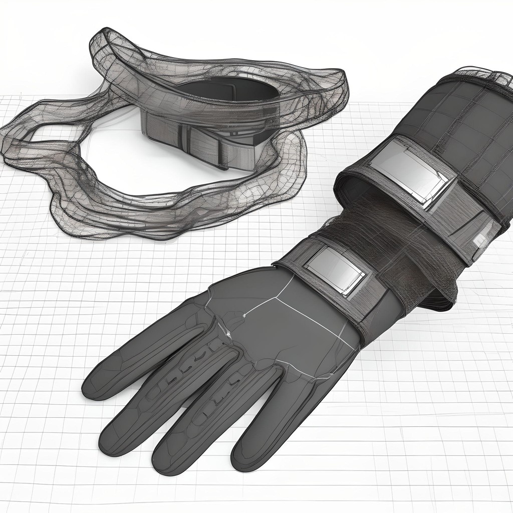
1/ Through wearable accessories like gloves and wristbands, users can feel textures, vibrations, and temperatures of virtual objects, using haptic feedback. For example, users can feel the coolness of a metal watch or the warmth of a wool sweater
2/ Using vibrotactile feedback or vibrations to simulate the sensation of touching or handling objects. For instance, when a user reaches out to touch a virtual object, the gloves or wristbands vibrate in a way that mimics the texture and resistance of that object's surface.
3/ Motors or mechanical resistances uses force feedback in the gloves or wristbands simulate the weight and push-back of virtual objects. Example: Pushback from buttons on electronic devices or the stiffness of a backpack's straps.
4/Incorporating elements that use thermal feedback to change temperature, these devices can simulate the warmth of a virtual sunbeam or the coolness of water. Small heating and cooling elements embedded in the gloves or wristbands adjust temperatures quickly to match the virtual environment's conditions.
DO THE USERS EVEN WANT THIS?
FACT: Humans love humans!
A study by Yale University about Shared Experiences revealed that students, although given the same chocolate, enjoyed the chocolate more when there were other people in the room (Boothby, Clark, & Bargh, 2014).
Can we bring about more connectivity by eliminating hassles? Probably. Imagine being able to shop in a virtual store from different physical locations, sharing opinions and recommendations as if you were physically with your friends together.
Lets look at what the users have to say

Google Consumer AR Survey, Global, 2019

Deloitte Digital
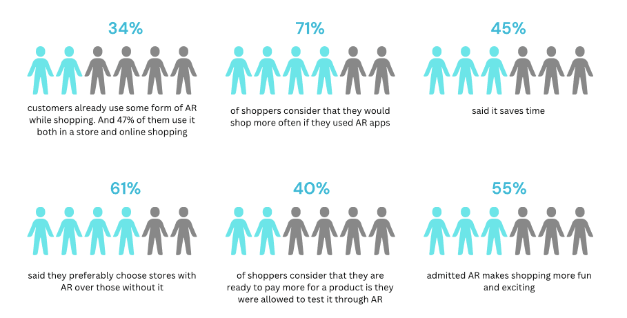
Deloitte Digital
LET'S LOOK AT THE PHYSICAL SPACE
How do people move through a retail space? will they be rushing or lingering? how will their movement change in different parts of the space?
Two words: deliberate, exploratory.
WHAT COULD THE USERS BENEFIT FROM?
1/ Looking at prices, discounts and reviews at a quick glace
2/ Imagining how the item looks in the user, this concept could use 3D body scanning technology to generate lifelike model of the user and they on the clothes the user is glancing.

WHAT SPATIAL EXPECTATIONS DO PEOPLE HAVE AND HOW DO WE APPROACH THEM?
1/ People want the physical space to be obstacle free, minimal so the virtual elements can take over.
2/ Ability to move around safely and feely should not be compromised but enhanced.
Bonus Points: Less resources spent in physical world means less money spent, less environmental waste and less clutter
WHAT KIND OF SPACES SHOULD BE UTILISED FOR WHAT PURPOSE?
1/ Users can set preferences for how they want to interact with virtual elements and other users
Example: user could specify if they are open to social interactions with other shoppers' avatars or prefer to shop undisturbed and the system would respect these preferences.
However, given the context, the biggest concern is safety and how crowded the space is.
HOW SHOULD WE APPRACH SAFETY CONSIDERATIONS? - PROXEMIC PRINCIPLES
1/ The main functionality of this device is to augment virtual elements on top of the physical space. It is important for the user to be aware of what is happening in their physical space while also using the virtual space.
2/ Proxemic Principles can guide the development in a way that directs the users along paths that respect personal space boundaries using visual cues such as arrows to lights to lead users through less crowded store aisles.
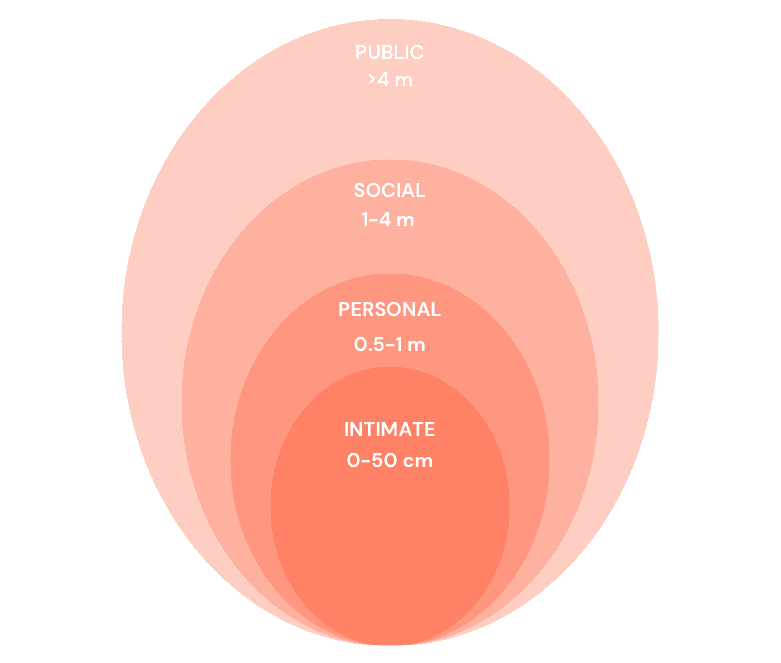
Hall's Proxemic Zones
USING PROXEMIC ZONES
1/ Personal Space Zones: Create a personal space zone around each user and the user would be alerted if another shopper is entering this space.Here, the user would be guided through arrows to less crowded aisles
2/Level Changes: The users could be alerted if there are levels or indents to account for their safety.
WHAT KIND OF VIRTUAL CONTENT IS POSSIBLE?
Here is how I categorised the content to serve different aspects of user needs.
PRACTICAL CONTENT
EMOTIONAL CONTENT
ACCESSIBILITY CONTENT
PRACTICAL CONTENT
1/ Interactive displays that provide detailed information about products when looked at or selected (think: specifications, availability, price)
2/ An augmented reality interface that allows for customers to check out items without the need for physical cash registers.
EMOTIONAL CONTENT
1/ Creating a narrative experience around products or brands that help users makes an emotional connection with the products (think: journey of a coffee bran from farm to cup)
2/ Virtual environments that change to match the mood or marketing campaigns (think: a cozy fireplace setting in the "winter coats" section)
3/ Features that allow customers to share experiences or create moments and connect with friends and family, even if they are not physically present.
ACCESSIBILITY CONTENT
1/ Allow users to change the size, contrast, and color of the VR content to meet their individual needs.
2/ Provide real-time translation of store signs and product information to facilitate shopping for non-native speakers or those with hearing impairments.
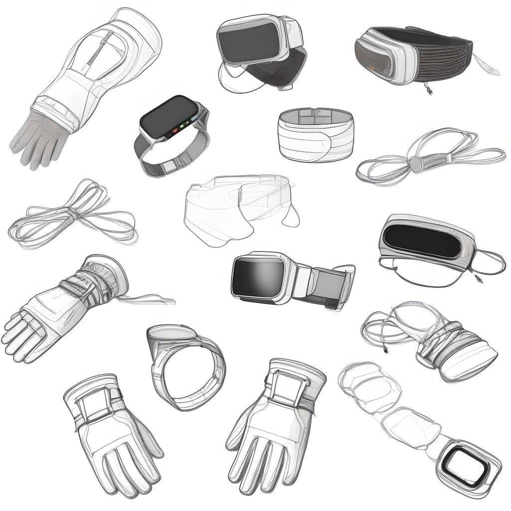
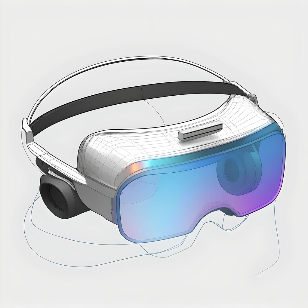
SKETCHES
CONCLUSION & WAY FORWARD
This case study is more than just about creating a product. It is about learning how to blend technology that enhances, rather than disrupts natural human behaviour. As we move forward, Next Gen Retail stays a concept, but it is still a starting point for more ideas and improvements. It is prompt for me to think about ongoing research and development, pushing me to keep exploring how digital and physical can coexist more smoothly.
For me, this was a big learning experience in iterating and refining my work style. It called for me to explore the concept from various different dimensions and using it to give me more clarity than muddle up my thoughts. It pushed me to dissect complex or "wicked" problems piece by piece and break down larger issues into more manageable parts to allow for more targeted solutions.
Interested in connecting?
Let’s talk projects, collaborations, or anything design!
Copyright 2024 by Priyanvada Darshankar
