Elevate
Introducing Elevate, this innovative app designed to offer tailored mock interview questions and instant personalised feedback using AI.
Role
UX Researcher & Designer
Tools
Figma, Adobe Creative Suite, White Paper Research, Affinity Mapping, User Interviews, Competitive Analysis, Customer Journey, Sketching, Wireframing, Prototyping
THE PROBLEM
The shift of interviews from in-person to remote during COVID brought two problems
1
Building rapport over a screen required more than just good answers.
2
Candidates struggle to convey and interpret crucial non-verbal cues, such as subtle facial expressions, eye contact, and hand gestures, which are essential for creating a connection in remote interviews.
DISCOVERY RESEARCH
Inaccessible non verbal cues lead to awkward interview dynamics
Candidates overcompensate by relying heavily on verbal communication, which can make the conversation feel stiff or overly formal. Establishing an authentic connection, which is often done through humor, empathy, or shared non-verbal understanding, remains unexplored
67%
Recruiters reject candidates after one round because of poor grammar
Source: Jobspin
77%
Recruiters reject candidates after one round because of poor grammar
Source: Careerbuilder
39.3%
Candidates leave a bad impression due to their overall confidence level
Source: Jobspin
DEFINING THE CHALLENGE
DEFINING THE CHALLENGE
"How might we make users feel and be confident in approaching online interviews by improving non-verbal communication?"
"How might we make users feel and be confident in approaching online interviews by improving non-verbal communication?"
USER INTERVIEWS
1
How many people did I interview?
17 interviews conducted over Zoom and in person
2
Age group
21 - 35 years old
3
Occupations
Students, recent graduates, mid level professionals, senior professionals
IF THE USERS SPOKE
User Needs
Build rapport with their interviewee and tell their story confidently
But, currently
Users are imited to generic feedback on the quality of their answers
So, lets
Give the users role-specific, hoistic feedback on their storytelling
WHAT ARE THE COMPETITORS DOING?
04
Competitor Platforms

Huru

Big Interview

Pramp

Virtual Speech (VR Practice)
03
Major Gaps
Scope limited to generalized roles (think: software developer) but don't account for nuanced roles (think: scrum master).
They also lack preparation of different interview types.
(like: scholarship, admission interviews, part-time teaching assistant)
No personalization based on keyword analysis of the job description and the user's resume
BRAINSTORMING SOLUTIONS
Initial Exploration
AR, VR or Mobile App. AR/VR woild offer immersive and interactive experience
But
AR/VR would introduce more complications like steeper learning curve and hurt daily usability
Core Outcomes
Recognising that the core outcomes are - confidence and skill enhancement
Final Solution
Outcomes could be delivered with a straightforward mobile app without the added complexity
EXPLORING AI
1
Feedback
Real-time feedback on speech patterns, tone, body language
2
Mock Interview
Extract user's experiences from the resume and provide suggestions on how to tailor the answers to the role specifications done through keyword analysis
3
Result?
Effective story telling skills, interpersonal skills and highly personalized answers to the questions
DEFINING THE NECESSARY FEATURES
Typical Current V.S Proposed Information Architecture
INITIAL IDEATION
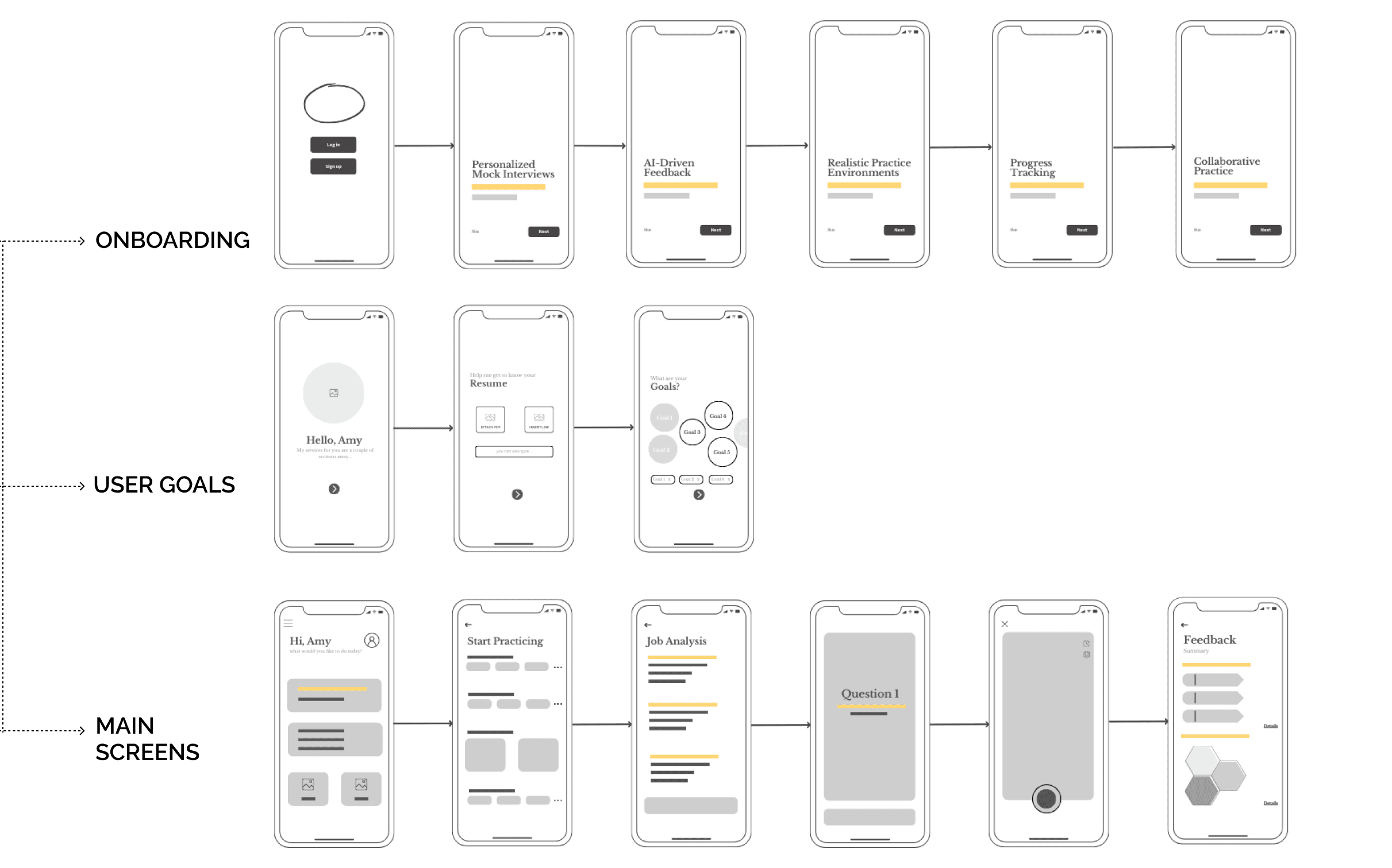
WIREFRAMES
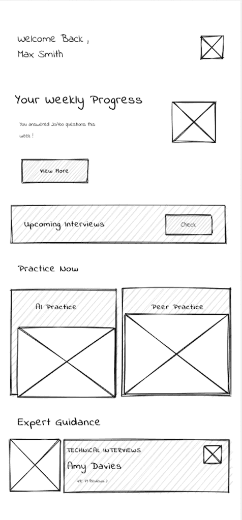
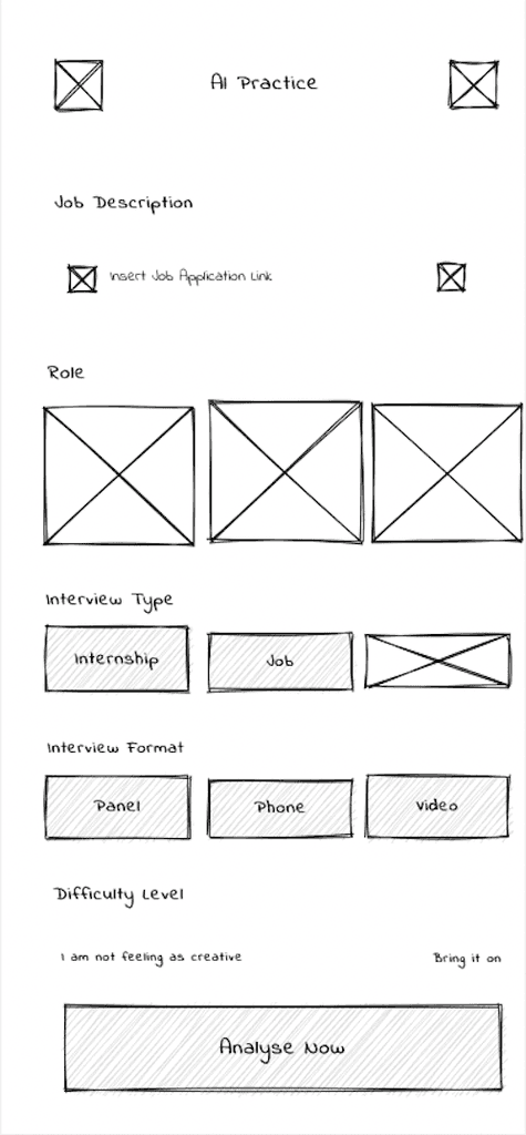
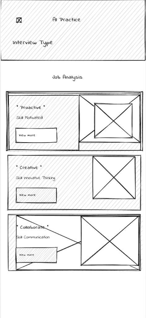
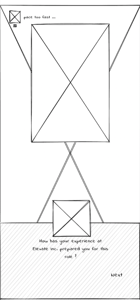
I used Axure RP for wireframes.
TESTING THE CONCEPT
I conducted usability test on the first iteration of the solution. The Figma file of the first iteration and insights from usability testing are as follows
Success Criteria
Users should easily navigate between sections with a logical, intuitive flow and minimal learning effort.
Users should complete key tasks (e.g., role selection, mock interviews, feedback review) in 2-3 steps from the homepage.
Should not overwhelm users with too much information or complex layouts. Each screen should focus on a clear, single goal to prevent decision fatigue.
Insights
1
Users found Role Selection buried under multiple layers of navigation
2
Feedback Screen presented too much information at once
3
Some users did not know how to navigate to feedback quickly after the interview
FINAL DESIGN OUTCOME

For everyone
From Novices to Pros – Practice at Your Own Pace
Minimalist Interface
Maximum Focus

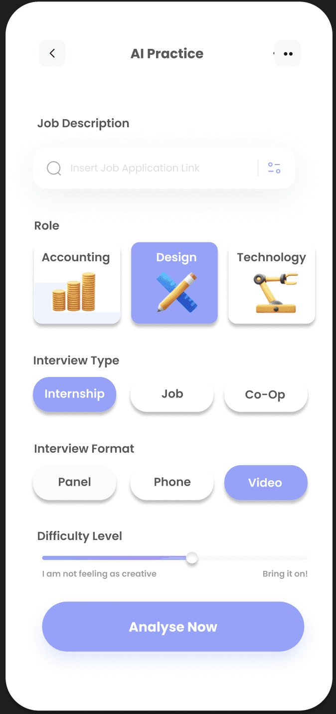

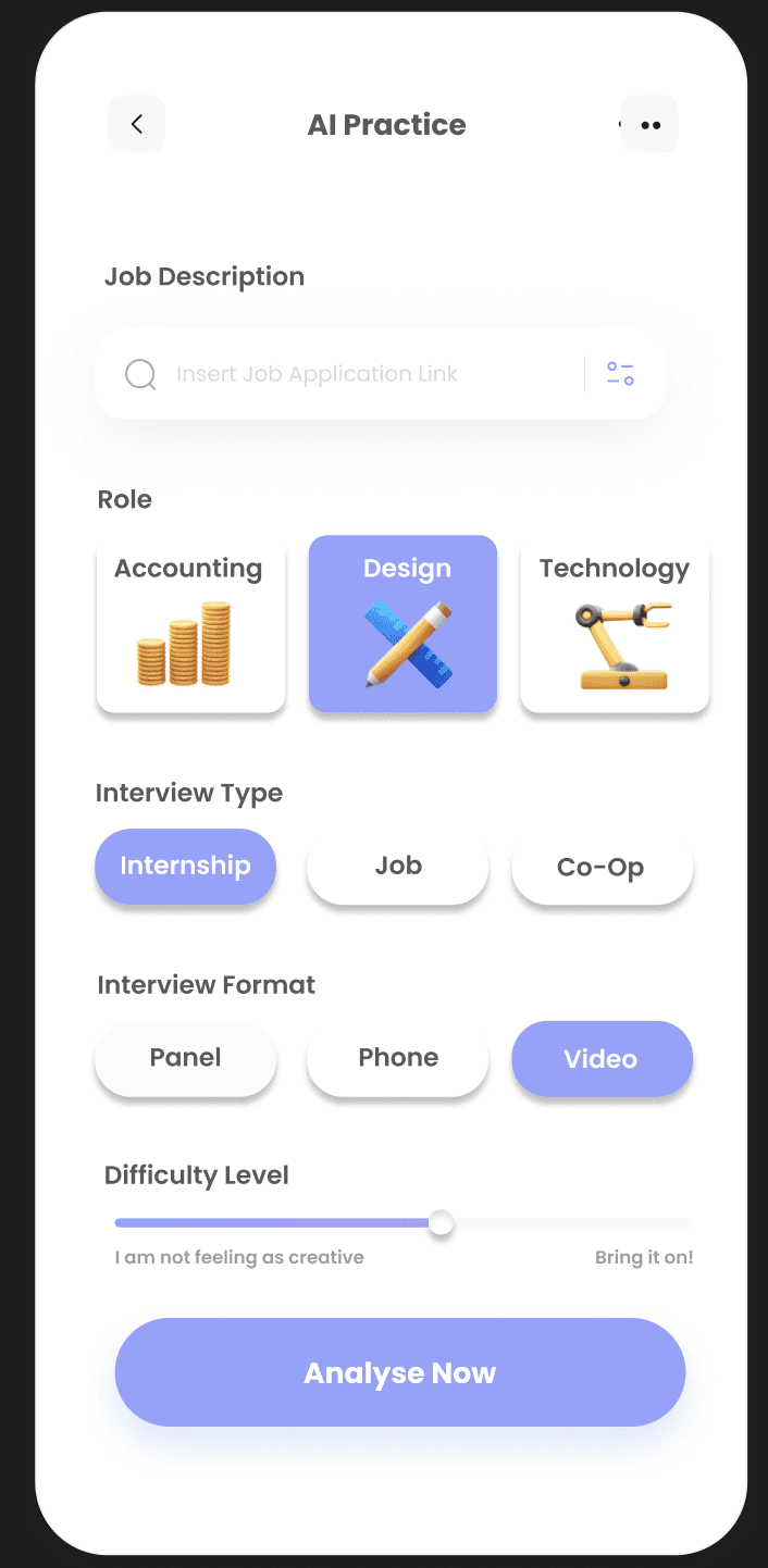
Create your own practice
Select from a range of interview roles, types, format and difficulty level

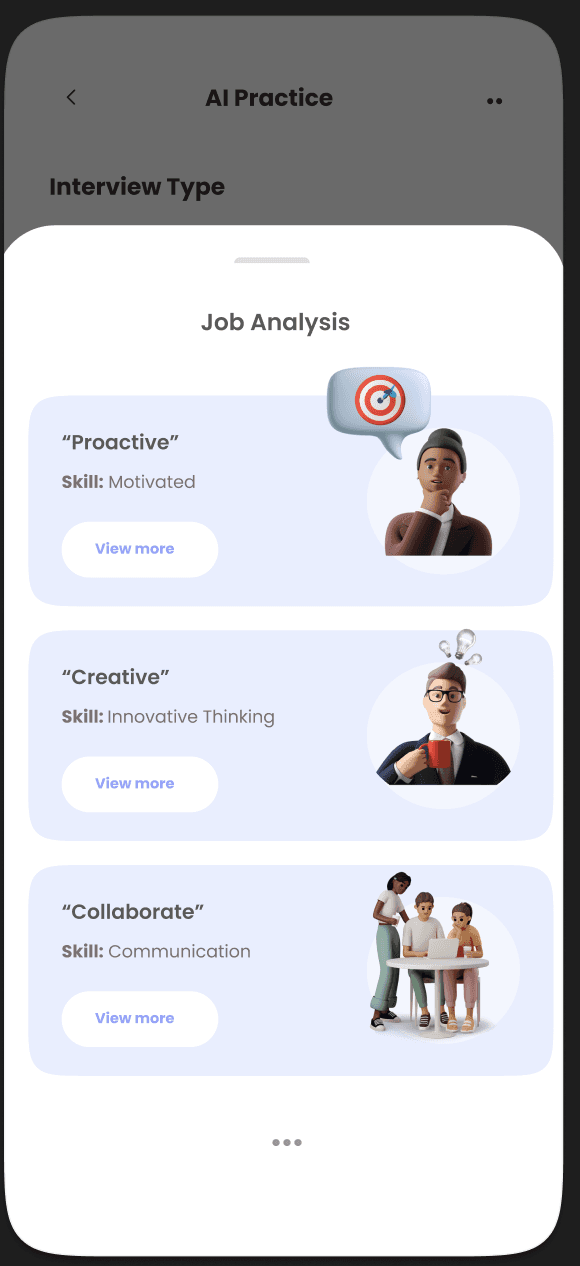
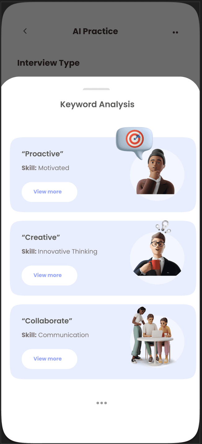
Keyword Analysis
Get a list of keywords the job requires and tailor your answers accordingly

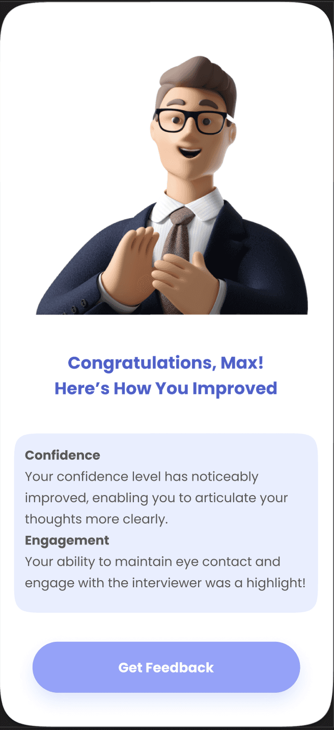
See how you have improved
Get an instant analysis of how you have improved or get deeper with the feedback
Calender
Track Past and Upcoming Interviews Effortlessly
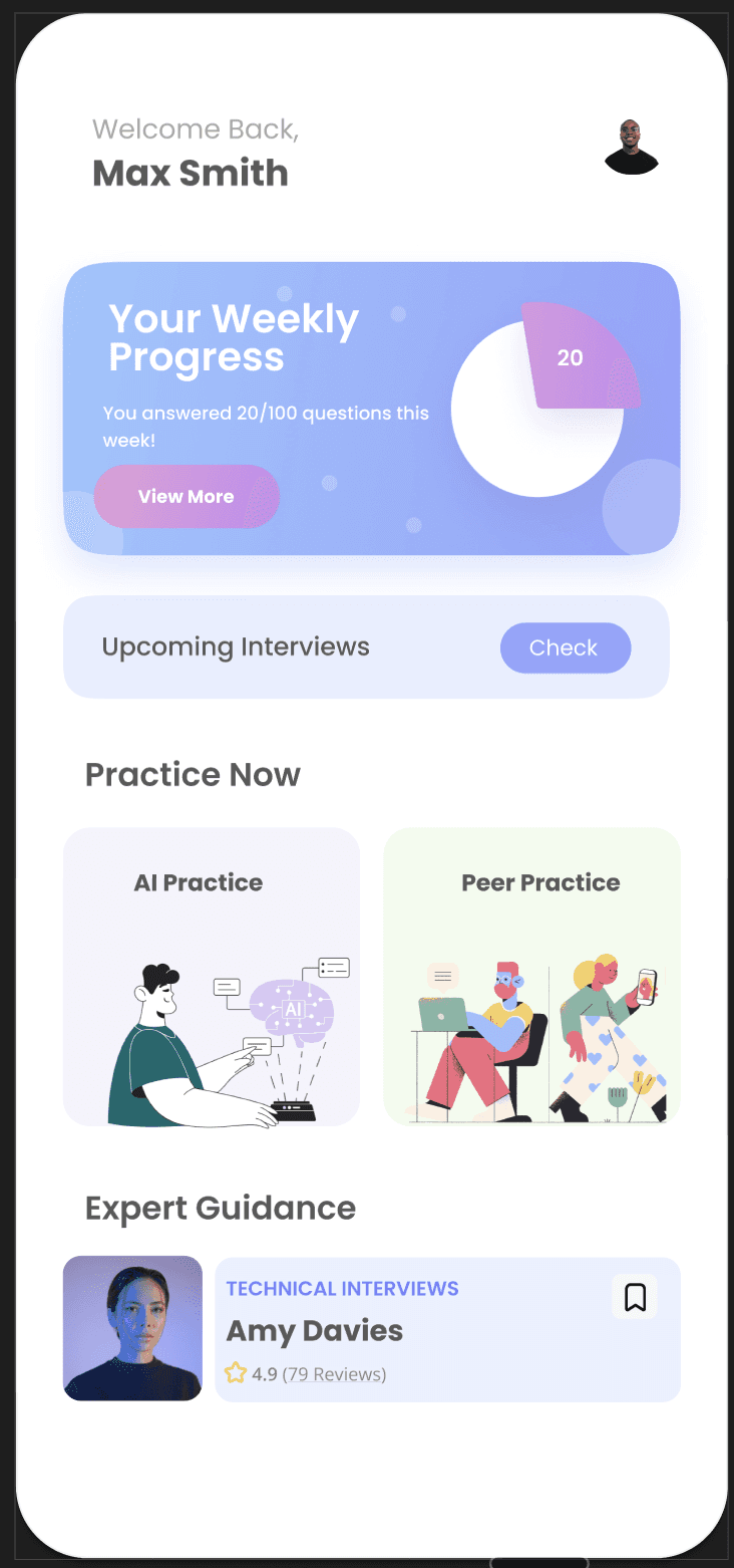
Collaborative Learning
Peer Practice and Expert Guidance at Your Fingertips
Prepare Smarter, Not Harder
Make ElevateAI YOURS by adding your resume and your goals

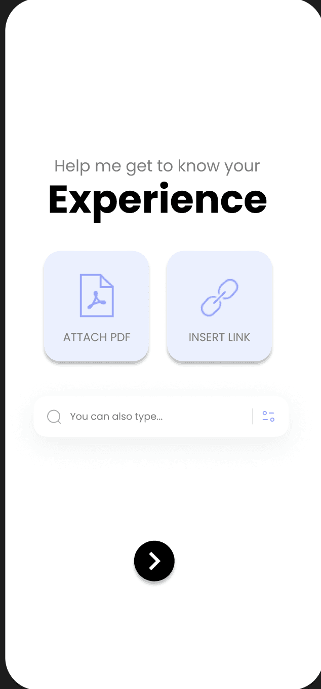

Input Your Resume
Attach PDF, Insert link or type your experience

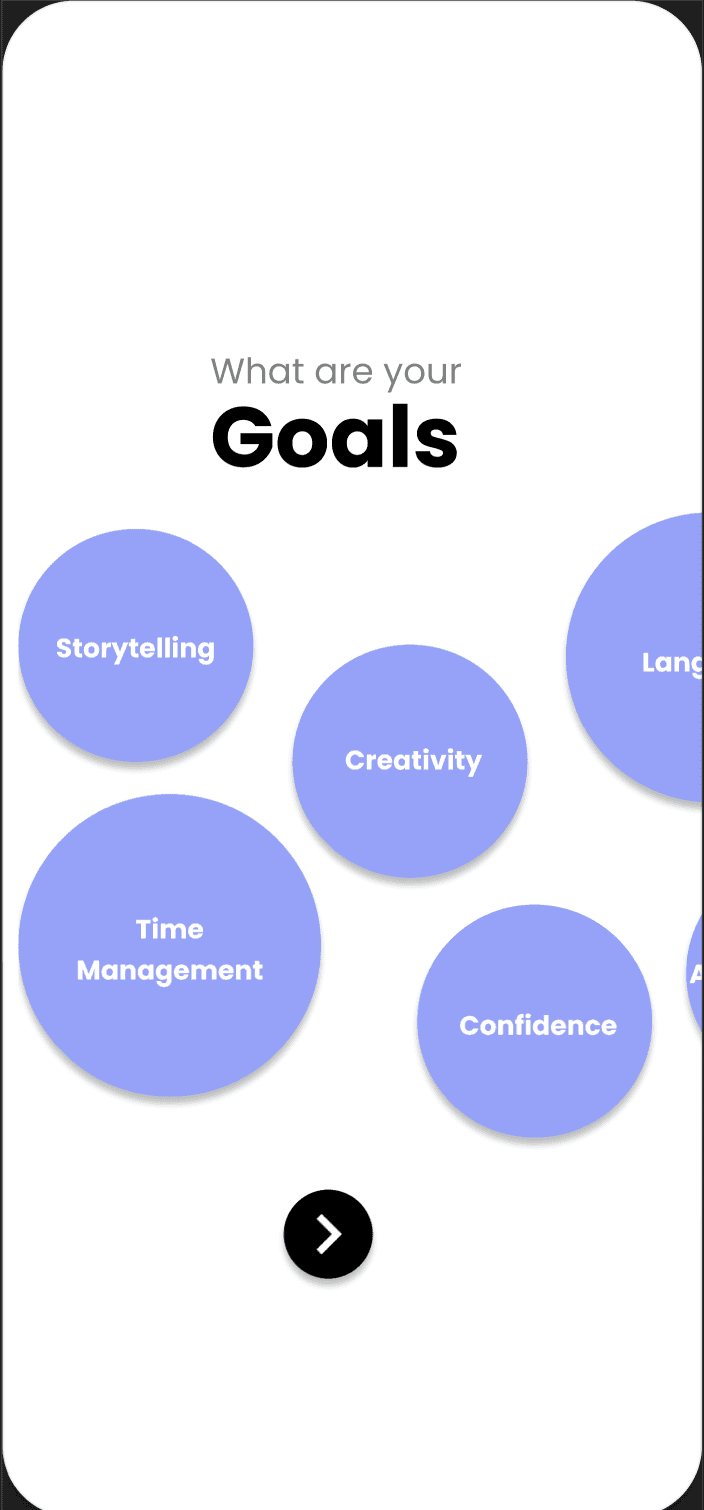

Set your Goals
Your first impression is your last impression

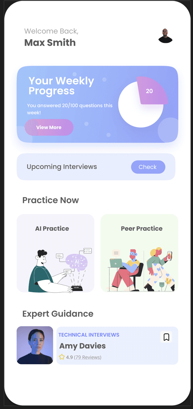

Get Started
Select from AI practice, practice with peers or connect with experts.
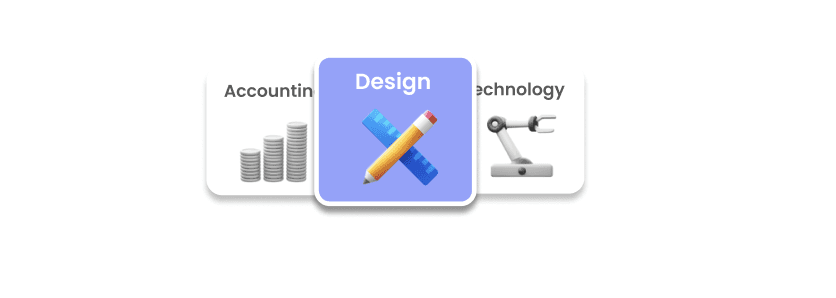
Pick your role
Select the type of role you want to interview for
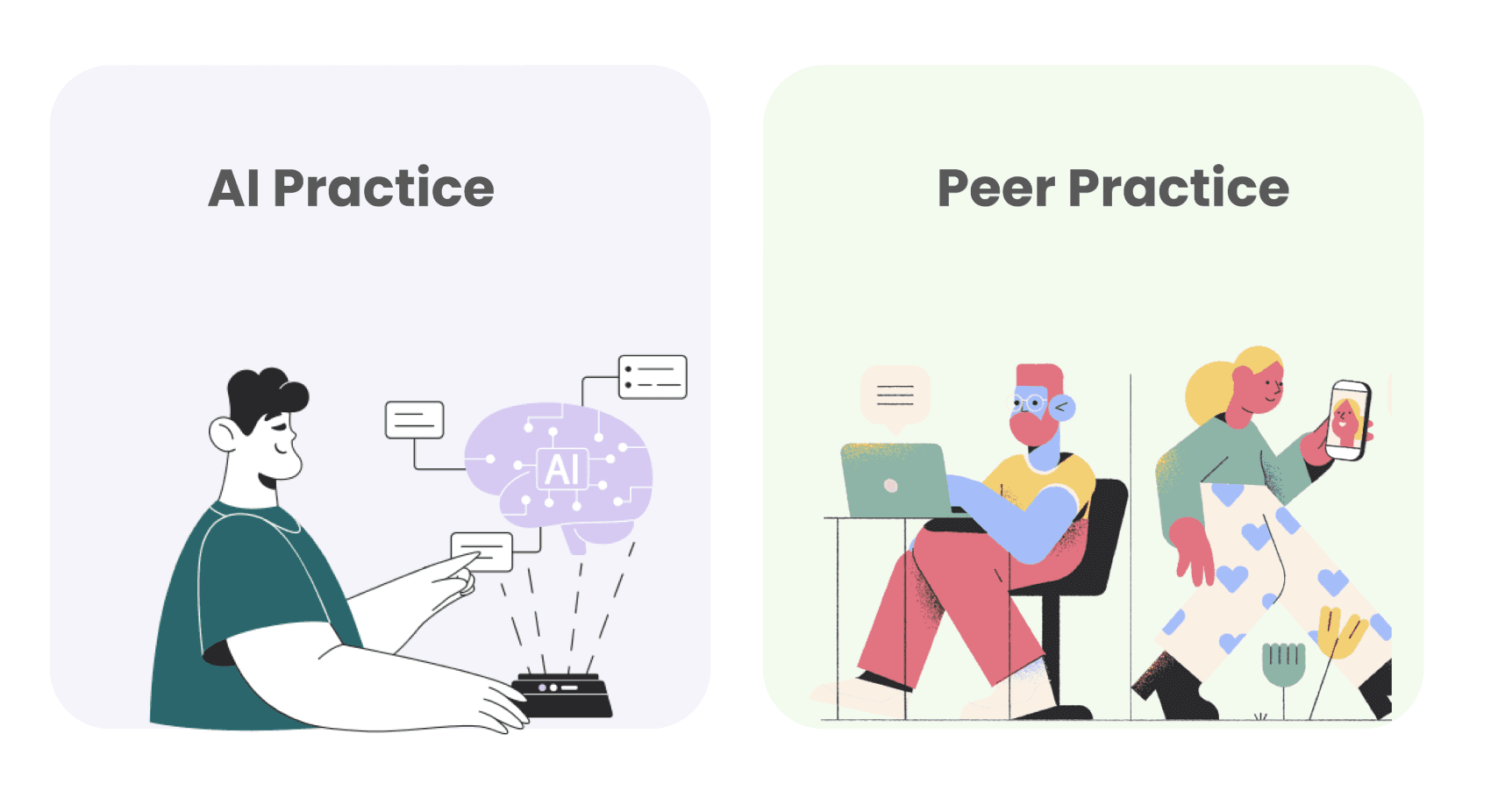
Pick how you wanna practice
Enable collaboration with your peers or practice with AI
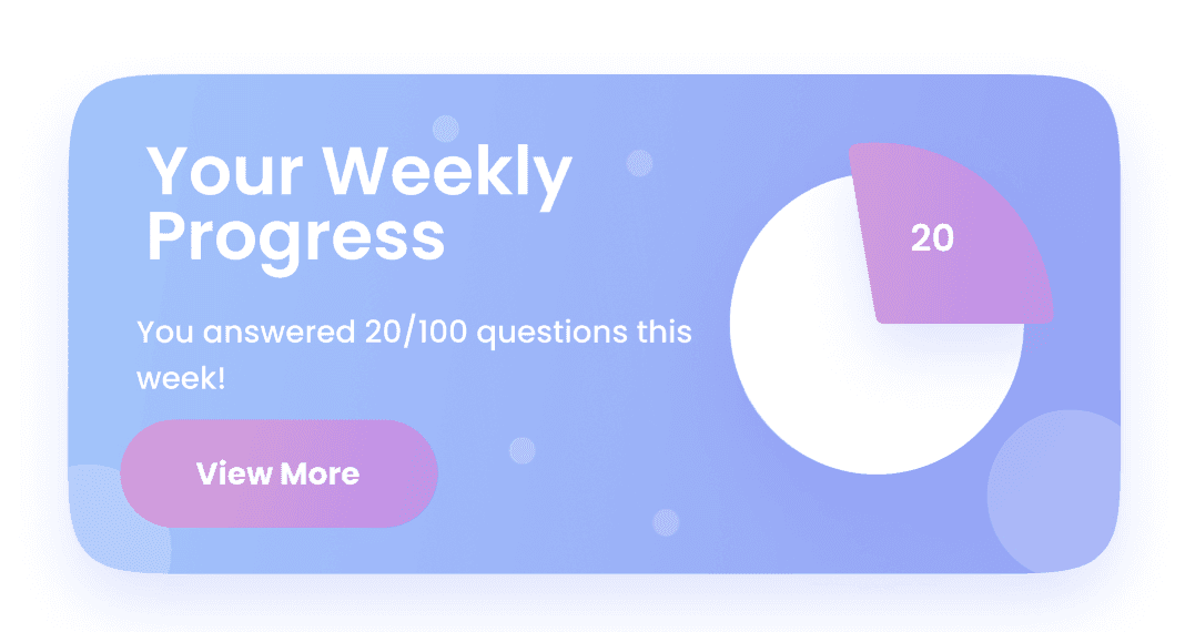
Stay on track with your progress
Set and track your progess goals
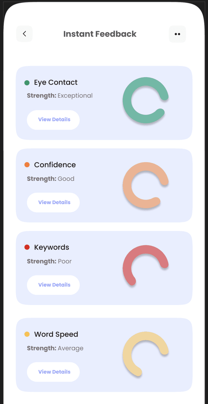
Get Instant Feedback
Continue practicing and get instant feedback on yout goals

LEARNING OUTCOMES
1
Perfection is the enemy of good
Making mistakes and fixing them taught me more than if everything had gone right the first time. It's better to make something good and keep making it better than to wait around trying to make it perfect
2
Design is iterative, not linear
Revisiting and refining designs multiple times led to more intentional, user centered solution
3
Accessibility is a Core Principle, Not an Afterthought
Usability testing showed how adhering to WCAG standards early on ensured the design was inclusive, reinforcing that accessibility should be baked in from the very start of the design process
Copyright 2024 by Priyanvada Darshankar
